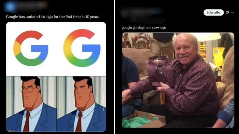
Following the last update nearly ten years ago, Google changed its iconic 'G' icon. The latest update showcases the four solid colour sections, blending together. Red bleeds into yellow, yellow into green and green into blue. The change, a bit more subtle, brings it in line with the gradient it uses for the Gemini logo's design, reflecting the search engine giant's ongoing focus on AI. Google's new logo has now sparked funny memes and jokes, and the change on Google's 'G' is hardly noticeable. Internet users are having a field day with hilarious reactions taking over X (formerly Twitter) as they can barely spot the difference between the old and new logo. Google Logo Updated: First Major Redesign of ‘G’ Logo in a Decade, Rolls Out on iOS and Pixel Devices.
Google's New Logo
Google's New Logo
Personally it's looking 'G'ood pic.twitter.com/p2MeqGprEG
— Melvin (@melvinkjoze) May 12, 2025
Google New Logo Sparks Funny Memes
google getting their new logo pic.twitter.com/rWb9xwsWyo
— drefanzor memes (@drefanzor) May 12, 2025
Spot the Difference
Google has updated its logo for the first time in 10 years pic.twitter.com/fnmhdnD7ND
— Morning Brew ☕️ (@MorningBrew) May 12, 2025
LOL
Why is everyone gooning to the new Google logo ITS LITERALLY THE SAME LOGO BUT WITH A BLUR ON IT pic.twitter.com/YkPtSb0v1N
— Christian (@brocodevs) May 13, 2025
The Change is Subtle
“For the first time in a decade, #Google has unveiled a refreshed design for its iconic “G” logo, marking a significant update to its branding.”
Tweet courtesy - @rawsalerts
They had ten years to come up with this 😒
I couldn’t even find the difference. #GoogleNewLogo pic.twitter.com/0LvtStcmY7
— Homskyra (@homskyra) May 12, 2025
The Before and After Look
Google’s new rebranded logo
Before: After: pic.twitter.com/mL73VKQ9PM
— NIK (@ns123abc) May 12, 2025
The Update in 10 Years
Google has updated its iconic 'G' logo for the first time in nearly ten years. pic.twitter.com/V26GO6CpUI
— Marketing Maverick (@MarketingMvrick) May 13, 2025
ROFL
Google just gave its logo a glow-up! 💅
Old vs New — which one’s winning your heart or hurting your eyes? 😂
Drop your hot takes...💬 pic.twitter.com/A3GQ4akCJ4
— Daud Hasan (@daudhasandesign) May 13, 2025
That's It?
Had to pull out all the stops to make the new @google logo pic.twitter.com/NxFe2KSDJN
— Seb Cornelius (@SebCornelius) May 13, 2025
(SocialLY brings you all the latest breaking news, fact checks and information from social media world, including Twitter (X), Instagram and Youtube. The above post contains publicly available embedded media, directly from the user's social media account and the views appearing in the social media post do not reflect the opinions of LatestLY.)


 Quickly


