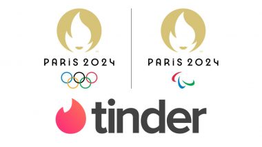
The logo for the 2024 Olympics and Paralympics was unveiled late on Monday night. It depicts the Olympic flame enclosed within a gold disc. “It brings together three iconic symbols connected to the sport, the Games and France – the gold medal, the Olympic and Paralympic flames, and Marianne,” said a release from the organisers. The symbols represent both the “simple and powerful” and “reveal a face that embodies our ambition to put people at the heart of the Games." Interestingly the logo was all about evoking the French culture and its rich history but instead faced ridicule online with fans comparing it to stereotypical French woman, a courtesan and finding similarities with dating app Tinder. Paris 2024 Olympics Logo Revealed: Golden Marianne to Replace Colourful Eiffel Tower Emblem; See Pics.
“I congratulate Paris 2024 on the launch of their new emblem. It perfectly reflects their vision and desire to put people at the heart of the Olympic Games Paris 2024,” Pierre-Olivier Beckers-Vieujant, the International Olympic Committee Coordination Commission Chair for Paris 2024 was quoted as saying in a statement put out by the organisers.
The New Emblem for Paris Olympics 2024
I am the new emblem of #Paris2024 pic.twitter.com/Oykq6SQnnv
— Paris 2024 (@Paris2024) October 21, 2019
“The combination of the gold medal, the Olympic flame and Marianne brings together the values, history and French touch that will make these Olympic Games truly special. I believe that this innovative design will be quickly recognised around the world and be a wonderful calling card for the Olympic Games Paris 2024.”
Netizens, however, found no similarities with these in the logo. “The French Olympic logo tumbles out of bed on a Parisian morning, said a user. Another raised questions that the new design looked more like a Parisian woman than Marianne. Many others were also confused if it was a logo or an advert for a hair salon or a shampoo.
Is it an Olympics Logo or Tinder App's New Emblem
Swiping left on this Olympics logo #Paris2024 pic.twitter.com/k3eXF9e5q0
— James Fenton (@fentonjames16) October 22, 2019
Speak to the Manager
...I think the #Paris2024 logo would like to speak to the manager pic.twitter.com/QjlCfsF9zL
— Andy Social (@YoJonez) October 21, 2019
Worth a Try!!
Is it weird to have a crush on the #Paris2024 Olympic logo? pic.twitter.com/dwXovlHirN
— stukulele (@stukulele) October 22, 2019
A French Courtesan
The French Olympic logo tumbles out of bed on a Parisian morning. She tousles her messy bob, dons breton stripes and ballet flats and whisks down the stairs from her fifth-floor apartment to grab a baguette before enigmatically texting two men who are pursuing her romantically. pic.twitter.com/5R2PVaXaa6
— Megan Clement (@MegClement) October 21, 2019
The Tinder Link
Le logo des #JO @Paris2024 dévoilé, à ne pas confondre avec @Tinder, bien que ce soit un beau clin d’œil à la culture Française ! 🇫🇷🔥
Sinon, un super article à lire traitant sérieusement de ce logo sur @lemondefr sous la plume de @NLepeltier ! 🖋️https://t.co/nPXZ6YWQep pic.twitter.com/US0LhleICw
— J.A. (@JAJeanAlexis) October 22, 2019
New Logo
I fixed the Paris 2024 Olympics logo. Now it's perfect. pic.twitter.com/DGUjXvWMkJ
— Daniel Modell (@dmnyc) October 22, 2019
Similarities
The Paris Olympic logo is just Rachel from Friends pic.twitter.com/MqAnPEimqs
— joel (@jbhofmann) October 22, 2019
Isn't it For Athletes
So the next Olympics, in Paris is only for Manga girls? Paris 2024 Olympic logo revealed #logo #LogoDesign pic.twitter.com/c4HoyyFwza
— Designer Steve (@adhesive_design) October 23, 2019
This will also be the first time the same emblem will be used for the Olympic and Paralympic Games with only the rings of Olympics and the Agitos of the Paralympic marking the differences. “The logo also pays tribute to Paris as the host city of the Games, as its pure, understated lines and its original typeface take their inspiration from Art Deco, the first complete artistic movement, which reached its height at the 1924 Games in Paris. It expresses just how proud the country is to be welcoming the world to its capital city in 2024,” said the release.
“The Olympic and Paralympic flames always conjure up special memories. The flame invites us to dream, to engage and to come up with new ways of staging the Olympic and Paralympic Games. It reflects the unique energy of the Games, which bring people together and drive solutions forward. The Games will help improve the lives of the inhabitants of the Seine-Saint-Denis area by bequeathing useful infrastructure to them: eco-neighbourhoods, through the conversion of the athlete and media villages into housing, and the creation of local sports facilities, such as the Olympic Aquatics Centre.
“Finally, Marianne. With its feminine traits, the Paris 2024 emblem pays tribute to a woman who is a French national symbol known around the world. She embodies the revolutionary spirit that infuses the Paris Olympic and Paralympic Games. She encapsulates the desire to bring the competitions out of the stadium and into the heart of the city. A familiar figure who is everywhere in the everyday lives of French people, she is also a reminder that these Games will be Games for everyone, Games that will belong to the people. Her face is also a homage to female athletes and a nod to history, as it was in 1900 at the Olympic Games in Paris that women were first allowed to compete,” the release added.
(The above story first appeared on LatestLY on Oct 23, 2019 01:20 PM IST. For more news and updates on politics, world, sports, entertainment and lifestyle, log on to our website latestly.com).


 Quickly


